The QML Nuggets Behind border.color, Layout.fillWidth, and NumberAnimation
Ever written border.color, Layout.fillWidth, or NumberAnimation on x without thinking twice about it? They feel like they’re just part of the language, like QML somehow knows what you mean. It doesn’t. Each one of these little nuggets is C++ machinery someone built on purpose, so that using it would feel effortless.
In this post we crack a few of them open and look at how they work under the hood, on the C++ side, and what you actually gain by learning to build your own. The intent of the post is to give you a high level view of how these patterns work. I won’t dive deep into the C++ code itself, because that would take dozens of pages. Instead, I’ll sell you on the patterns and why you should care, and if you are interested, you can find a full walkthrough of this in Chapter 5 of Qt6 QML Advanced, which is also available on Amazon.
The project we build is called QmlAdvCore, and it is structured as a library of reusable QML types, with a demo app that consumes it and a test suite that exercises it directly. We start by setting up the project and it is made up of two sibling projects: QmlAdvCore and QmlAdvCoreDemo. The library is a CMake project that builds a shared library, and the demo is a CMake project that links against it. We also add a test suite to the library project, so we can guard against regressions as we build each new type. The honest truth is that I wanted an excuse to show you how to use QTest though :-)
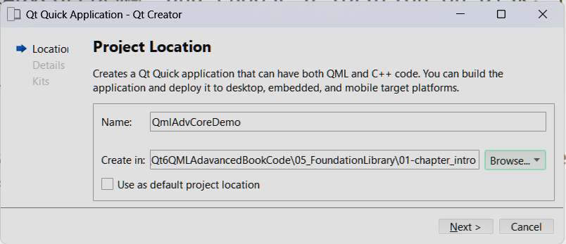
With the project in place, we then move on to build one QML property pattern, one at a time!
Object Properties
The first nugget is dot-notation like Theme.colors.primary. The idea here is that we have a Theme property, and inside that property is a colors property, and inside that is a primary property. The dot notation is just a way to access nested properties, but the magic is that each of those properties can be a live, bindable object.
Turns out there is no special syntax behind it. It is just a Q_PROPERTY returning a pointer to another QObject, chained as deep as you like. That is exactly how a Theme singleton ends up owning a ColorPalette and a SpacingGroup, each with their own live, bindable properties.
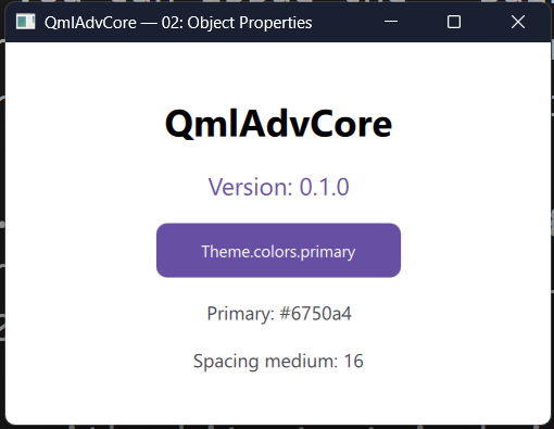
In the image above, the purple rectangle and the spacing between the items on screen are not hardcoded values. The rectangle’s fill is bound to Theme.colors.primary, the text inside it uses Theme.colors.onPrimary so it always stays readable against that background, and the gap between the items comes from Theme.spacing.medium. Nothing on screen is a magic number. Every visual detail is read live from the one Theme singleton, which is exactly why this pattern is worth having: change a color or a spacing value in one place, and the whole UI updates.
Why it’s worth knowing: any time you want a family of related settings to read as one clean, namespaced object instead of a pile of flat, loosely related properties, this is the tool. It’s the difference between Theme.colors.primary and five unrelated top-level properties you have to remember by name.
List Properties
Next is the pattern behind a type like FormGroup accepting a list of FormField children:
FormGroup {
    fields: [
        FormField { label: "Username" },
        FormField { label: "Password" }
    ]
}
The tool is QQmlListProperty<T>, backed by four callbacks (append, count, item-at, clear) that QML calls behind the scenes whenever it processes a list literal.
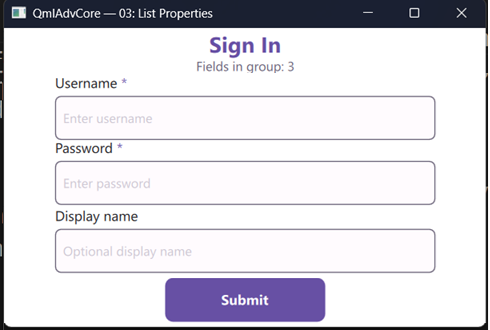
In the image above, you can see the form fields rendered as three rows, with the required fields marked with an asterisk. The FormGroup type is responsible for managing the list of FormField children, and it exposes a fields property that QML can bind to. We set up all this plumbing on the C++ side, so that when QML sees the fields: [ ... ] list, it knows how to append each FormField to the FormGroup’s internal list.
Why it’s worth knowing: this is what lets a custom type accept a whole collection of declarative children, the same way ListView.model or a Repeater does. Once you have it, any container you design can grow or shrink its content purely from QML, with the C++ side just reacting to appends and removals.
Default Properties
List properties are nice, but they still make you write fields: [ ... ]. Default properties give you a way to drop the wrapper and just write the children directly inside the container. You kind of tell QML “this is the default property for this type, so anything you see inside it belongs to that property.” So if we declare a card like shown below,
 Card {
    Rectangle {...}
    Rectangle {...}
 }
QML will take the list of cards and automatically append them to the contentItems list property of Card, without you having to write contentItems: [ ... ] anywhere. Pretty cool right? It is the same trick that makes ListView and Repeater work.
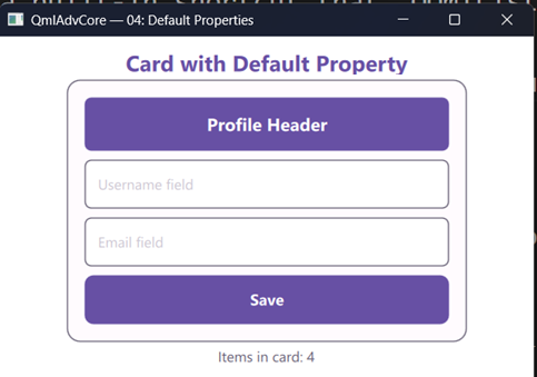
In the image above, the rendered cards are set up like shown below
Card {
    id: profileCard
    width: 360
    padding: Theme.spacing.medium
    spacing: Theme.spacing.small

    // children go here
    Rectangle {
        height: 48; radius: 6
        color: Theme.colors.primary
        Text {
            anchors.centerIn: parent
            text: "Profile Header"
            color: Theme.colors.onPrimary
            font.pixelSize: 16; font.bold: true
        }
    }

    Rectangle {
        height: 44; radius: 6; color: "white"
        border.color: Theme.colors.secondary; border.width: 1
        Text {
            anchors { left: parent.left; leftMargin: 12
                        verticalCenter: parent.verticalCenter }
            text: "Username field"
            color: "#CAC4D0"; font.pixelSize: 13
        }
    }

    //...
}
There is no contentItems: [ ... ] anywhere in that QML, which would be the equivalent of the fields property we set up earlier for our FormGroup. Card is a QQuickItem that has a default property, so any child items declared inside it are automatically added to its internal list of children. It also reads its own padding and spacing properties, stacks each child top to bottom, and resizes itself to fit exactly the content it was given, which is why the surrounding surface hugs the four rows with no wasted space.
Why it’s worth knowing: it’s what makes a custom container feel like a first-class QML citizen instead of a workaround. Anyone using Card writes plain, nested QML, the exact same way they already write Rectangle { Text {} }, with nothing extra to remember.
Grouped Properties
You may have already used things like border.color or font.bold without realizing they are actually grouped properties. Grouped properties are a way to take a flat list of loosely related properties and put them under one namespace, so that they read as a single object.
In the book, we take a set of rules and group them under a validation namespace, allowing us to write validation.required, validation.minLength, and validation.maxLength instead of three separate top-level properties.
FormField {
    validation.required: true
    validation.minLength: 3
    validation.maxLength: 20
}
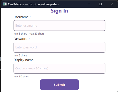
In the image above, look at the small grey hint text under each input box: “min 3 chars, max 20 chars” under Username, “min 8 chars” under Password, “max 50 chars” under Display name. Each of those lines is read straight through the grouped property and the user interface properly bound so it can update live as the rules change. The machinery to put this in place is shown in the book, but the important part is that the hint text is only generated when the rule is set, and it reads directly from fieldAt(index).validation.required
Why it’s worth knowing: it keeps a type’s public API tidy as it grows. Instead of FormField accumulating a dozen loosely related flat properties over time, related settings get grouped under one name, exactly the way the Qt team already does it with font and anchors.
Attached Properties
This is the mechanism behind Keys.onPressed and Layout.fillWidth: a property that another type adds to yours from the outside. We build Form, so any TextField anywhere can gain live validation in four lines, with zero changes to TextField itself.
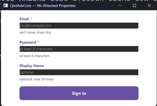
In the image above, each of the fields may be declared like shown below:
TextField {
    id: emailField

    Form.field:    "email"         // machine-readable field name
    Form.label:    "Email"         // human-readable label
    Form.required: true            // is this field mandatory?
    Form.hint:     "we'll never share this"

    Form.onErrorChanged: errorLabel.text = Form.error   // react to validation

    onTextChanged:  Form.validate(text)                 // trigger validation
}
The three fields, Email, Password, and Display Name, are plain, unmodified TextField items. TextField itself knows nothing about validation. Every bit of behavior you see, the field metadata, the red “Email is required” style error text that appears the moment you clear a required field and disappears the moment you type again, comes from a FormAttached object that Form silently parks on each TextField because of a few Form.field, Form.required, and Form.onErrorChanged lines written on it. The text field is doing none of the work; it is just wearing the attachment.
Why it’s worth knowing: it lets you add behavior to types you don’t own and can’t modify, without subclassing or wrapping them. Any built-in or third-party item can suddenly participate in your system, just by having a few lines written on it. This is the same trick that makes Keys.onPressed work, so you can add keyboard handling to any item without subclassing it. If you master this, you can also build this kind of behavior into your own types.
Property Value Sources
Ever wonder what NumberAnimation on x { } actually is? It is a property value source: an object that takes ownership of a target property and drives it over time. We build Pulse, a reusable heartbeat effect that animates any real-valued property on any item.
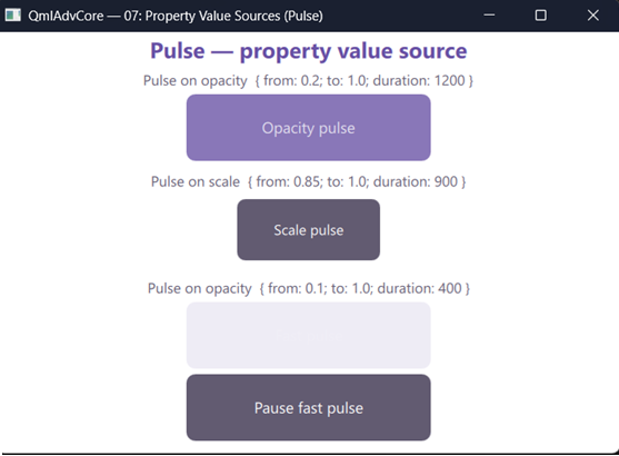
In the image above, three boxes are all breathing on their own: one fading in and out slowly through opacity, one growing and shrinking through scale, and one fading quickly, with a button underneath that pauses and resumes it mid-animation. None of the three rectangles ever sets opacity or scale itself. Each one just declares Pulse on opacity { ... } or Pulse on scale { ... }, and from that point on Pulse owns the property and writes new values into it on every frame, using the exact same from, to, and duration you handed it in QML.
Why it’s worth knowing: it’s how you package a piece of behavior, not just a value, as something reusable across any property on any item. Write Pulse once, and it animates opacity today and scale tomorrow, with no extra code. Again, details for the interested are shown in the book, but the Qt team uses this same trick to make NumberAnimation work, so you can animate any numeric property on any item without subclassing it.
Non-Visual Services
In the last parts of the chapter, we focus on non visual aspects of the library, that may be used throughout your app. We put together two types.ToastManager and UndoStack are pure C++ singletons with no UI of their own, reachable by name from any QML file in the app. UndoStack manages history and fires signals; the app decides what undoing actually means. ToastManager owns the state; the QML overlay owns the look.
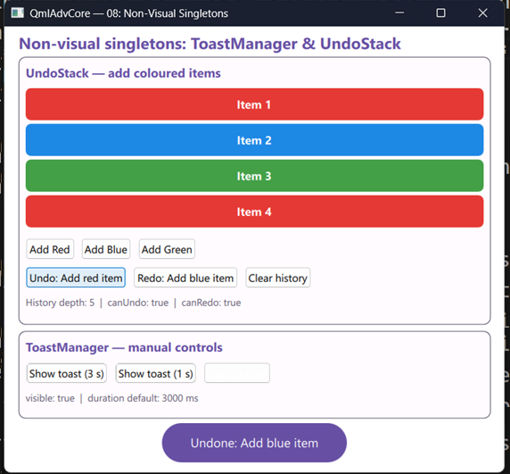
In the image above, clicking “Add Red”, “Add Blue”, or “Add Green” does three things at once: it appends a coloured row to the list, calls UndoStack.push(...) to record the action, and calls ToastManager.show(...) to pop the little rounded banner you see at the bottom of the window. Click Undo and the last row disappears, the Undo button’s own label updates to show the next command in line, and a fresh toast announces what was undone. Neither singleton (UndoStack or ToastManager) has ever heard of the other, or of the list on screen. UndoStack only tracks history and fires signals; the QML wiring is what decides those signals mean “remove the last list row.”
Why it’s worth knowing: it’s a clean way to give your whole app shared, cross-cutting state, like notifications or an undo history, without threading properties down through every layer of your UI or reaching for global variables.
Packaging and Publishing
With all the types built, tested, and working in the demo, the final step is to package it up so other projects can use it. We turn the finished collection of types into a real, installable CMake package, with generator expressions, install rules, and a config template for find_package. Then we publish it to GitHub, so it can be pulled into any project with a single FetchContent declaration and a Git tag. This is how real libraries are built and shared out there!
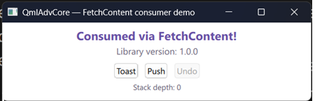
In the image above, this window belongs to a completely separate project, consumer_fetchcontent, that has never seen QmlAdvCore’s source tree on disk. Its CMakeLists.txt only has a FetchContent_Declare pointing at a Git tag. Yet everything works: Version.string reports “1.0.0” straight from the library’s own CMake-generated version header, the toast buttons call into the same ToastManager singleton, and the undo stack behaves exactly as it did in the original demo. That is the payoff of the packaging work: every pattern built earlier in this post now travels with the library, wherever it’s pulled into.
Why it’s worth knowing: a set of useful custom types locked inside one project only helps that one project. Packaging turns your work into something you, your team, or anyone else can pull into a brand-new app in minutes, the same way you’d pull in any other Qt module.
Why It Matters
None of these patterns are exotic. They are the same building blocks the Qt team used to build Rectangle, Layout, and every animation type you already use daily. Once you’ve built each one yourself, “how does this component do that?” stops being a mystery and starts being a checklist: object property, list property, default property, grouped property, attached property, or value source. Pick the one that fits, and build it.
Want the Full Walkthrough?
This post covers the shape of each pattern, but there’s a lot more to each one: the actual C++ code, the tests that pin down the behavior, and the full packaging and publishing pipeline. All of it is in Chapter 5 of Qt6 QML Advanced, where we build every one of these types from an empty project to a published library, step by step.
If you’d like a discount on the book or any of the courses, check out the discounts page.
Happy coding!
Qt6 QML For Beginners Book
Master the fundamentals of Qt6 QML development with this comprehensive 400+ page guide. Learn declarative UI programming from scratch with real-world examples and cross-platform development techniques.
Qt6 QML Advanced - C++ Integration
Take your Qt6 QML skills to the next level with advanced C++ integration techniques. 350+ pages covering QML-C++ integration, performance optimization, and advanced patterns for production-ready applications.

Desktop Apps with Qt Widgets and C++
Master professional desktop application development using Qt Widgets and modern C++. 40+ hours of content with 5+ real projects. Perfect for beginners to intermediate developers.
Desktop Apps with Qt Widgets and PySide6

Learn to build powerful desktop applications using Qt Widgets and Python. 35+ hours of hands-on content with 4+ real-world projects to boost your Python GUI skills.
Qt QML From Beginner to Pro
Master modern UI development with Qt QML and Qt Quick. 50+ hours of comprehensive training with 6+ real projects. Build fluid, dynamic interfaces for desktop, mobile, and embedded devices.
Multi-Threading and IPC with Qt C++

Harness the power of multi-threading and inter-process communication in Qt. 8-12 hours of intensive training with 6+ hands-on demos. Take your Qt C++ skills to the next level.